info@aranetllc.com
+1 (305) 565-6218
If you are color-blind, you can try one of these alternatives:
Since when Google announced its new Mobile-First optimization, there are lots of discussions about it. Some just read parts of Google's posts and provide misleading information about the future of SEO saying responsive is OK.
Google has never said Mobile Responsive First. Has Never said Responsive First. Google Says Mobile First. This is the future of SEO
Simply, this means that you must have separate Mobile and desktop sites. And for search engine, those sites that have a separate optimized website have priority for indexing, PR and search listings. In order to avoid duplicate content error, you need to add a meta tag for every single page of your mobile site and another meta tag for desktop to tell search engines that one is the original and the other is canonical.
When you create a responsive website, you need to use large and high-quality images so that the responsive functionality, resize it for different width of the browser, widescreen monitor, or mobile. These images are usually big files and loading them take time. For example, you use 5 high quality 1600x400 pixels for the slider of your home page, each file will be around 400KB total of 2MB only for a slider. For desktop users that usually use a high-speed cable connection, this can be nothing, but not for a mobile user.
When you have a separate Mobile and Desktop, we have another scenario. The optimized width of images for a smartphone browser is 600 pixels. Now when you resize your 1600 pixel image to 600 pixels, the file size will be about 70KB and 5 images of 70KB create a total bandwidth of 350KB. (2MB vs 350KB). Now, optimizing just all images for the home page, will reduce the bandwidth traffic and speed up page load time. The same will apply to CSS and other scripts. For a mobile version, you will not need to load CSS and scripts that are used for the desktop version. all these will cause your pages to load much faster on a mobile device.
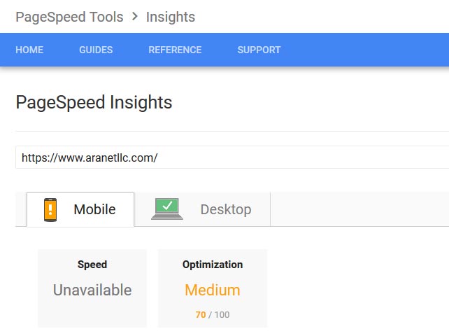
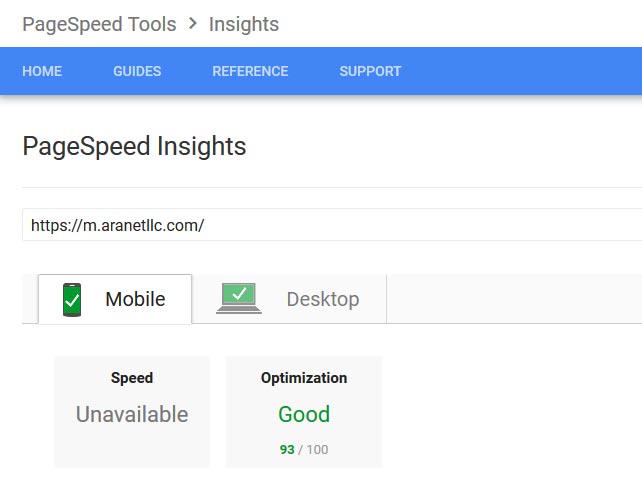

By Comparing the 2 above screenshots, you will see that Google does not accept a responsive desktop for mobile and accepts the separate mobile version.
When you have a Mobile-First custom site, the programmer has full control over the CSS codes and will create an interface with a minimum number of CSS and script file. Only necessary codes and scripts will be used. The fewer CSS and script file your page load, the faster your page loads.
WordPress is basically a Blog CMS. There are many plugins and themes that help you create a website with WordPress. You cannot expect the performance and functionality of a custom site from WordPress. Developer creates Mobile-First custom website specifically for you and your business. This does not apply to WordPress. It is a general-purpose Blog website that you can force it almost does that but with lots of plugins.
It is your website, but can you imagine how an image that is optimized for mobile looks like on a desktop monitor?


 [US] English